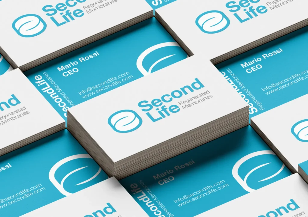
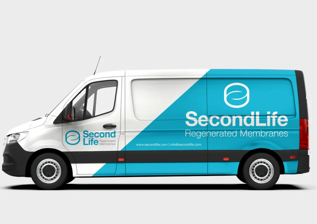
Second Life RO was created to give reverse osmosis membranes a second life: a certified process that recovers end-of-life SW membranes and turns them into high-performing brackish membranes. Our job was to translate this innovation into a technical, clean and recognisable visual identity.
For Second Life we built a visual identity starting from a complex technical project: the certified regeneration of reverse osmosis membranes. Our work was to turn a highly specialised industrial process into a clear, recognisable brand able to communicate innovation, reliability and value.
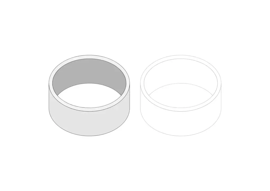
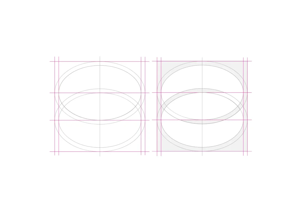
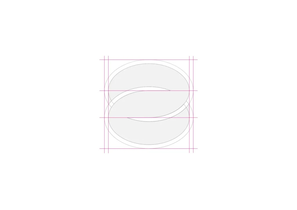
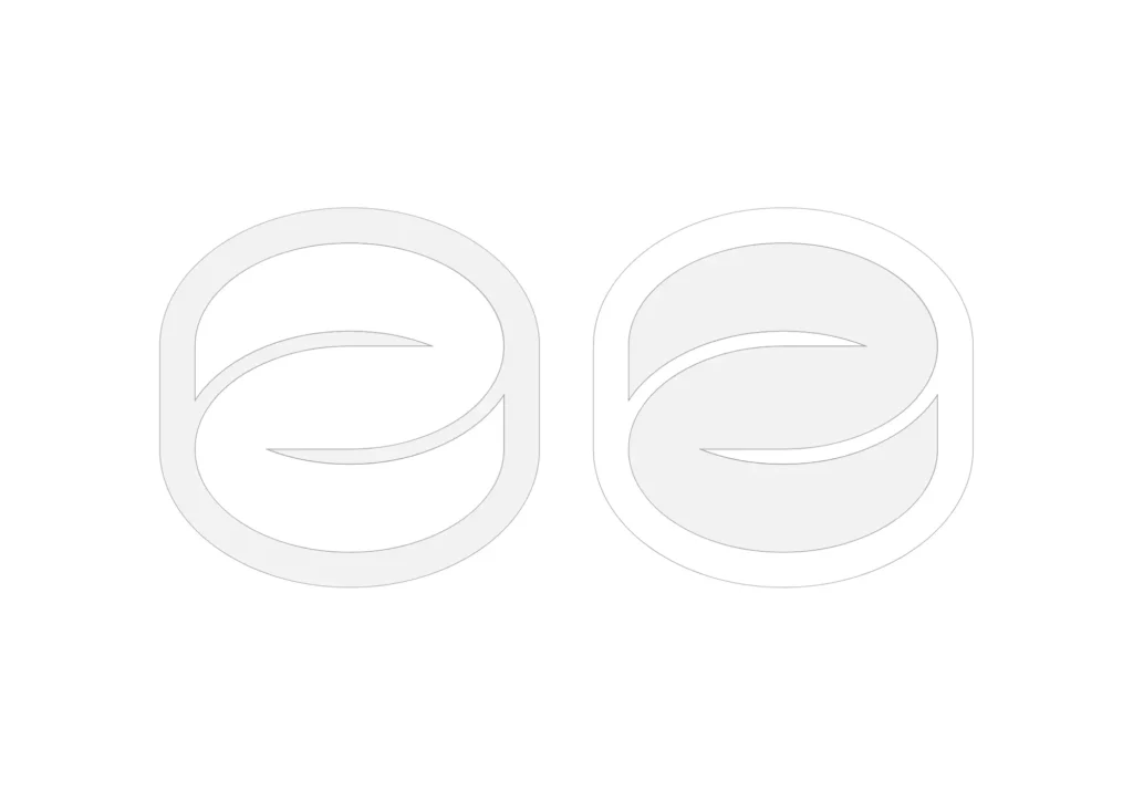
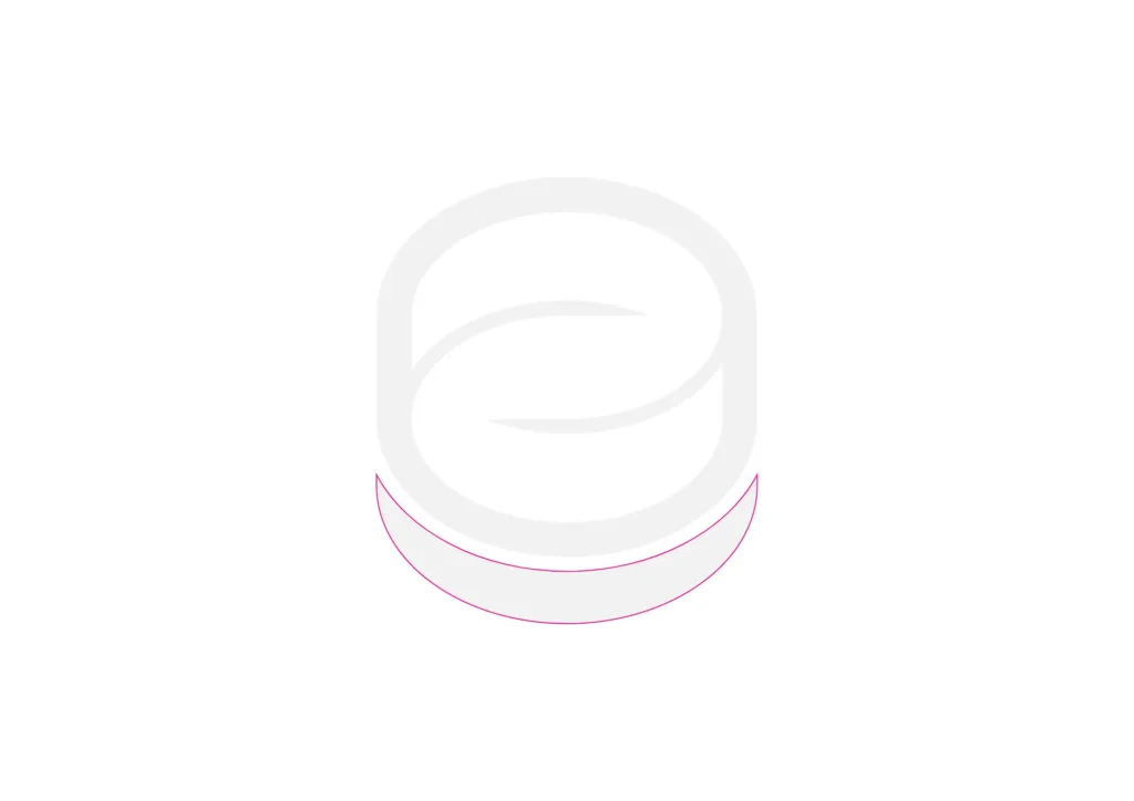
We designed the logo, symbol and corporate identity, working on a clean, technical visual direction. The mark comes from observing the product: the membrane’s internal sections were reinterpreted and merged until they recall the Second Life symbol, creating an identity tied to the product’s “second life”.
A branding project designed to give shape to what had been pure technology: making the project easier to understand, more memorable and ready to face the market with a solid, professional image.
* Related services
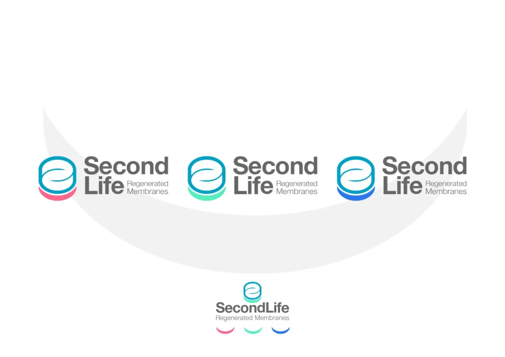
We created a modular visual identity that adapts to Second Life’s different operating areas without losing recognisability. The colour variants of the symbol help organise content, distinguish the company’s main areas and keep the brand clear, consistent and professional.
Talk to the Engine as you would to a person. Tell us about your project or ask anything about LU3G.